Classifying a non-linear dataset: A MerLin introduction from installation to classification
This notebook will guide you to classify the non-linear circles dataset starting from the installation of MerLin.
Lets first install MerLin with the following cell.
[ ]:
%pip install merlinquantum
1. Imports
Lets first import some packages, especially the merlin package
[100]:
import matplotlib.pyplot as plt
from matplotlib.colors import ListedColormap
import merlin
import numpy as np
from sklearn.datasets import make_circles
from sklearn.model_selection import train_test_split
import torch
2. Generate the dataset
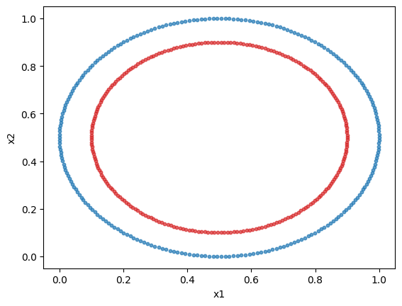
We will use sklearn’s circles dataset. It is a 2 feature, 2 class non-linear dataset. We will plot the dataset.
We will normalize the dataset to obtain better results. Indeed, in a angle-encoding paradigm (which will be used here), for an optimal performance, the values need to be normalized or scaled in a \([0,\pi)\) interval.
[149]:
dataset = make_circles(n_samples=500)
X = dataset[0]
y = dataset[1]

min_vals = X.min(axis=0, keepdims=True)
max_vals = X.max(axis=0, keepdims=True)
X = (X - min_vals) / np.clip(max_vals - min_vals, a_min=1e-6, a_max=None)

# Plotting the dataset
class_1 = []
class_2 = []

for features, label in zip(X, y, strict=True):
    if label == 0:
        class_1.append(features)
    else:
        class_2.append(features)

class_1 = np.array(class_1)
class_2 = np.array(class_2)

plt.scatter(class_1[:, 0], class_1[:, 1], s=10, color="tab:blue", alpha=0.7)
plt.scatter(class_2[:, 0], class_2[:, 1], s=10, color="tab:red", alpha=0.7)
plt.xlabel("x1")
plt.ylabel("x2")
plt.show()
3. Prepare the dataset
We will format the data to have it as tensors and split the dataset into a train and test set.
[180]:
X_train, X_test, y_train, y_test = train_test_split(
    X,
    y,
    test_size=0.15,
    stratify=y,
    random_state=42,
)

X_train = torch.tensor(X_train, dtype=torch.float32)
X_test = torch.tensor(X_test, dtype=torch.float32)
y_train = torch.tensor(y_train, dtype=torch.long)
y_test = torch.tensor(y_test, dtype=torch.long)

print(f"Train size: {X_train.shape[0]} samples")
print(f"Test size: {X_test.shape[0]} samples")
Train size: 425 samples
Test size: 75 samples
4. Create a simple MerLin quantum layer
It is now time to use MerLin. We will use a quantum layer to do the classification of the previous dataset. The simplest way to do so is to use the QuantumLayer’s simple method. The input size is the number of features.
[ ]:
layer = merlin.QuantumLayer.simple(input_size=2, output_size=2)
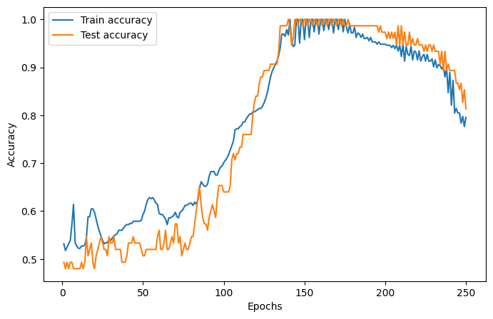
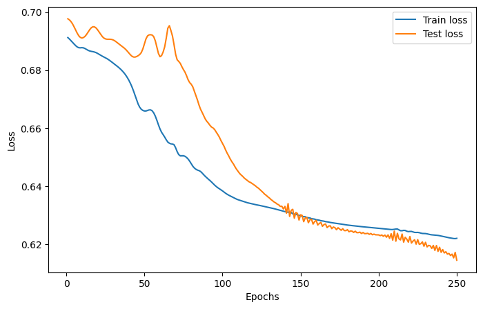
5. Training the layer
Since MerLin plugs into pytorch (a QuantumLayer is a torch.nn.Module), the training of the quantum model is the same as a regular pytorch module. Here is how to implement a simple training loop.
We will use the Adam optimizer, the cross-entropy loss function, a learning rate of 0.05 and 75 epochs.
The training and test loss and accuracies are plotted below.
[182]:
epochs = 250
lr = 0.02
optimizer = torch.optim.Adam(layer.parameters(), lr=lr)

train_accuracies = []
train_losses = []
test_accuracies = []
test_losses = []

for _ in range(epochs):
    # Train the model
    layer.train()
    optimizer.zero_grad()
    logits = layer(X_train)
    loss = torch.nn.functional.cross_entropy(logits, y_train)
    loss.backward()
    optimizer.step()

    # Evaluate the model on the train set
    train_preds = logits.argmax(dim=1)
    train_acc = (train_preds == y_train).float().mean().item()
    train_accuracies.append(train_acc)
    train_losses.append(loss.item())

    # Evaluate the accuracy of the model on the test set
    layer.eval()
    logits = layer(X_test)
    test_preds = logits.argmax(dim=1)
    test_acc = (test_preds == y_test).float().mean().item()
    test_accuracies.append(test_acc)
    with torch.no_grad():
        loss = torch.nn.functional.cross_entropy(logits, y_test)
        test_losses.append(loss.item())


epoch_range = range(1, epochs + 1)

# Accuracy plot
plt.figure(figsize=(8, 5))
plt.plot(epoch_range, train_accuracies, label="Train accuracy")
plt.plot(epoch_range, test_accuracies, label="Test accuracy")
plt.xlabel("Epochs")
plt.ylabel("Accuracy")
plt.legend()
plt.show()

# Loss plot
plt.figure(figsize=(8, 5))
plt.plot(epoch_range, train_losses, label="Train loss")
plt.plot(epoch_range, test_losses, label="Test loss")
plt.xlabel("Epochs")
plt.ylabel("Loss")
plt.legend()
plt.show()
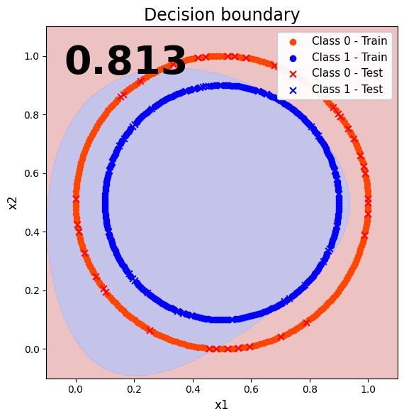
6. Evaluate the model
Lets check the performance of the model just a like a regular pytorch module.
[183]:
layer.eval()
with torch.no_grad():
    train_preds = layer(X_train).argmax(dim=1)
    test_preds = layer(X_test).argmax(dim=1)
    train_acc = (train_preds == y_train).float().mean().item()
    test_acc = (test_preds == y_test).float().mean().item()

print(f"The accuracy of the model on the training set is {train_acc}")
print(f"The accuracy of the model on the test set is {test_acc}")
The accuracy of the model on the training set is 0.7270588278770447
The accuracy of the model on the test set is 0.8133333325386047
7. Visualize the classification results (decision boundary)
To better visualize the performance of our quantum model, lets plot the decision boundary.
[184]:
# Plot range from full dataset
x_min, x_max = X[:, 0].min() - 0.1, X[:, 0].max() + 0.1
y_min, y_max = X[:, 1].min() - 0.1, X[:, 1].max() + 0.1

# Grid
xx, yy = np.meshgrid(np.linspace(x_min, x_max, 300), np.linspace(y_min, y_max, 300))
grid = np.c_[xx.ravel(), yy.ravel()]
grid_tensor = torch.tensor(grid, dtype=torch.float32)

# Predict on grid
layer.eval()
with torch.no_grad():
    out = layer(grid_tensor)
    Z = torch.argmax(out, dim=1)

Z = Z.cpu().numpy().reshape(xx.shape)

# Convert tensors once
X_train_np = X_train.detach().cpu().numpy()
X_test_np = X_test.detach().cpu().numpy()

# Background
bg_cmap = ListedColormap(["#e8b3b3", "#b6b6e6"])
plt.figure(figsize=(8.4, 6.0))
plt.contourf(xx, yy, Z, levels=np.arange(-0.5, 2, 1), cmap=bg_cmap, alpha=0.8)

# Train points
plt.scatter(
    X_train_np[y_train == 0, 0],
    X_train_np[y_train == 0, 1],
    c="orangered",
    s=35,
    marker="o",
    label="Class 0 - Train",
)
plt.scatter(
    X_train_np[y_train == 1, 0],
    X_train_np[y_train == 1, 1],
    c="blue",
    s=35,
    marker="o",
    label="Class 1 - Train",
)

# Test points
plt.scatter(
    X_test_np[y_test == 0, 0],
    X_test_np[y_test == 0, 1],
    c="red",
    s=40,
    marker="x",
    linewidths=1.5,
    label="Class 0 - Test",
)
plt.scatter(
    X_test_np[y_test == 1, 0],
    X_test_np[y_test == 1, 1],
    c="blue",
    s=40,
    marker="x",
    linewidths=1.5,
    label="Class 1 - Test",
)

# Accuracy text
plt.text(
    0.05,
    0.95,
    f"{test_acc:.3f}",
    transform=plt.gca().transAxes,
    fontsize=40,
    fontweight="bold",
    ha="left",
    va="top",
    color="black",
)

plt.title("Decision boundary", fontsize=17)
plt.xlabel("x1", fontsize=12)
plt.ylabel("x2", fontsize=12)
plt.xlim(x_min, x_max)
plt.ylim(y_min, y_max)
plt.gca().set_aspect("equal", adjustable="box")
plt.legend(loc="upper right", fontsize=11, framealpha=0.95)
plt.tight_layout()
plt.show()